
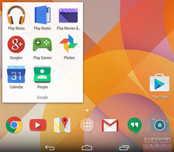
Google’s flat-look icons in Android 4.5
It appears that Google is planning to make the look of its app and service icons more coherent across the web and Android. A set of icons shown in a news piece by Android Police purports to compare a set of web icons, current Android icons and proposed Android icons which will appear in an upcoming Android update, perhaps in Android 4.5 Lollipop.
The new ‘proposed’ Android icons look to borrow much of their new design from the web icons, which are more readily updated by Google. Verifying their authenticity to some extent there are also new calendar, video and maps icons, similar to the proposed examples, to be found on a Google partners connect page.

